Byron Jacobson Photography
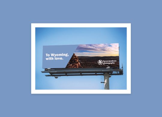
I helped a talented photographer who happens to be my brother, Byron Jacobson, develop a logo and brand for his business.
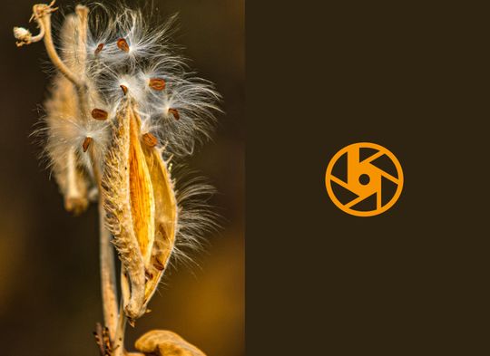
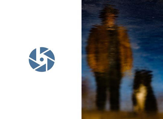
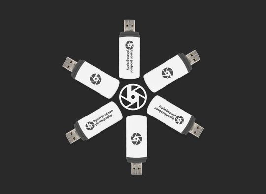
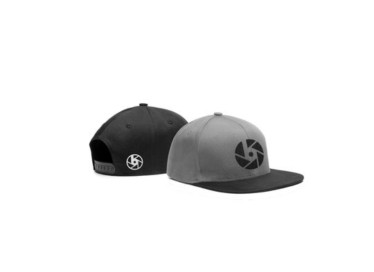
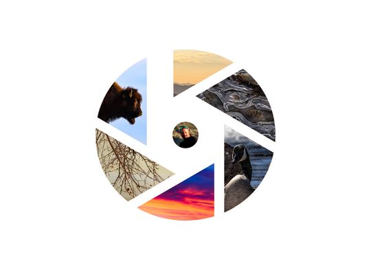
Photography logos are tough. A lot has been done. Nevertheless, the logomark came about due to the realization that a simplified aperture symbol could hold the shape of a “b.” Very simple but also convenient.
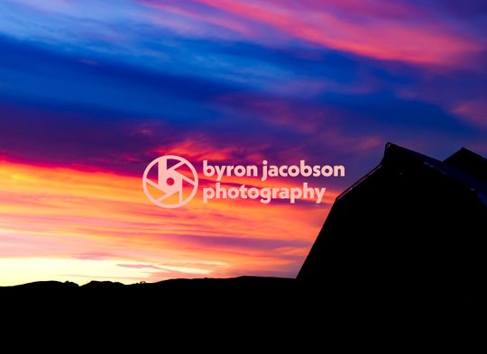
The rest of the brand builds off the mark, with color staying monochromatic to allow photos to shine. However, where appropriate, the logo and brand color can change to take on the color of a particular photo or photo series.




Colophon
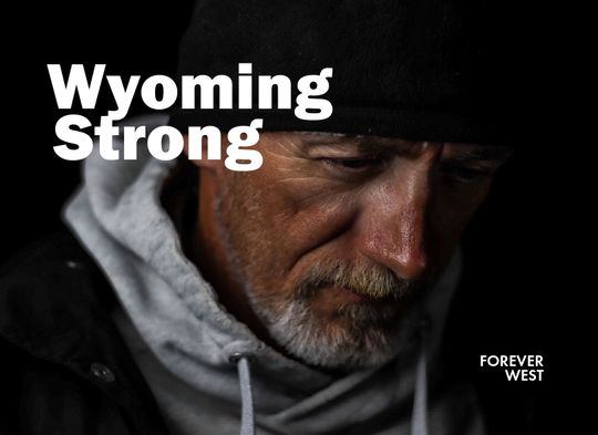
- Photography by Byron Jacobson
Type
- Franklin Gothic URW, Futura PT, and Neue Kabel
Images
- “Crewneck Sweatshirt Mockups” by Antonio Padilla. Pixelbuddha.
- “Free Billboards Mockup.” Graphic Pear.
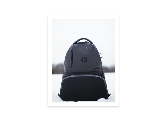
- “MANFROTTO ADVENTURE I” by Chris Knight. Unsplash.
- “Snapback Cap PSD MockUp” by Raul Taciu. GraphicBurger.
- USB drive by Markus Winkler. Unsplash.


