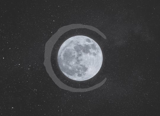
The Crescent Moon Coffee logo placed on the night sky

Date

December 2017

Client

Undergraduate education

Role

As part of a team, I was responsible for implementing the logo as well as parts of the brand application and presentation

Crescent Moon Coffee rebrand

This brand exercise was completed as part of group project for a design class. I was part of a three-person team, and we were tasked with rebranding a local coffee shop, Crescent Moon Coffee. During our research, we stumbled upon an Instagram post that sparked the idea for the logo, and we set about creating custom coffee stains. The rest of the branding took a less serious, far more playful tone. The following are some slides from our presentation.
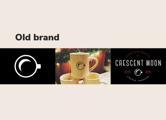
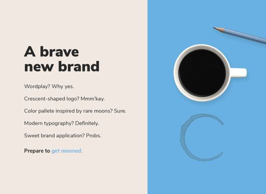
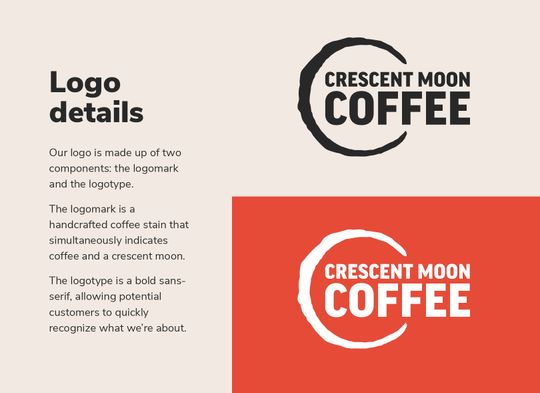
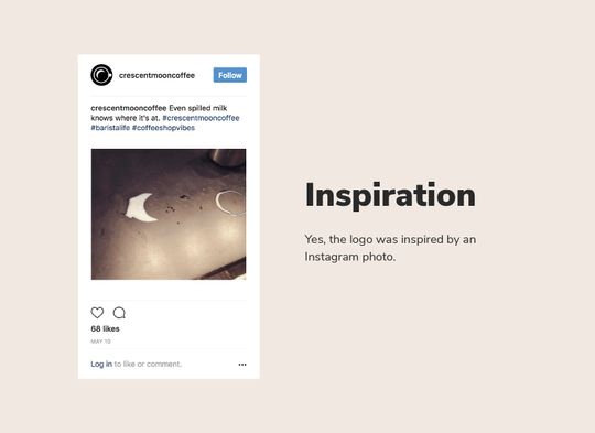
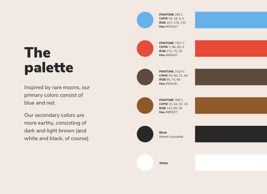
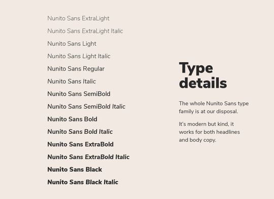
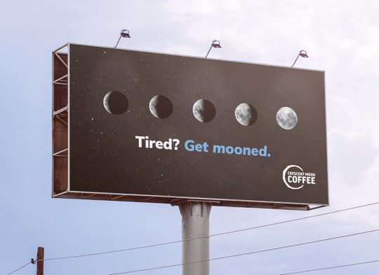
Examples of the old brand that include a crescent moon and coffee cupAn intro to the new brand that reveals a crescent-shaped coffee stain by a coffee cup and pencil. Reads: “A brave new brand. Wordplay? Why yes. Crescent shaped logo? Mmm’kay. Color palette inspired by rare moons? Sure. Modern typography? Definitely. Sweet brand applications? Probs. Prepare to get mooned.”The reasoning behind the logo. Reads: “Logo details. Our logo is made up of two components: the logomark and the logotype. The logomark is a handcrafted coffee stain that simultaneously indicates coffee and a crescent moon. The logotype is a bold sans-serif, allowing potential customers to quickly recognize what we’re about.”The Instagram post that inspired the logo. Shows a crescent-shaped milk spill. The Instagram post reads: “Even spilled milk knows where it’s at. #crescentmooncoffee #baristalife #coffeeshopvibes” Our comment reads: “Inspiration. Yes, the logo was inspired by an Instagram photo.”Our color palette. Reads: “The palette. Inspired by rare moons, our primary colors consist of blue and red. Our secondary colors are more earthy, consisting of dark and light brown (and white and black, of course).”Brand typography. Reads: “Type details. The whole Nunito Sans type family is at our disposal. It’s modern but kind, it works for both headlines and body copy.”Billboard mockup that shows moon phases during an eclipse (going from crescent to full). The tagline underneath reads: “Tired? Get mooned.” The logo is in the bottom right corner.T-shirt mockups showing front and back designs. The front has a small logo on the top-left, while the back has a larger design that reads: “get mooned”The coffee stain used in the logo is overlaid on a view of the night sky and a full moon

Colophon

Type

  • FF Good Pro, Nunito Sans

Images

  • Crescent Moon Coffee images were used from their social media: Instagram, Facebook.
  • “Billboard – Free PSD Mockup.” MockUpFREE.co.
  • “T-Shirt MockUp PSD” by Raul Taciu. GraphicBurger.
  • “Moon turning red during eclipse” by Jack Hill. Unsplash.
  • Moon by Pedro Lastra. Unsplash.
  • “Monochrome coffee and pencil” by Alex Padurariu. Unsplash.
  • “Minimal pencils on yellow” by Joanna Kosinska. Unsplash.
  • “Milky Way Wallpaper” by Free Nature Stock. Pexels.